paper

Art

Topography of Paint Landscapes

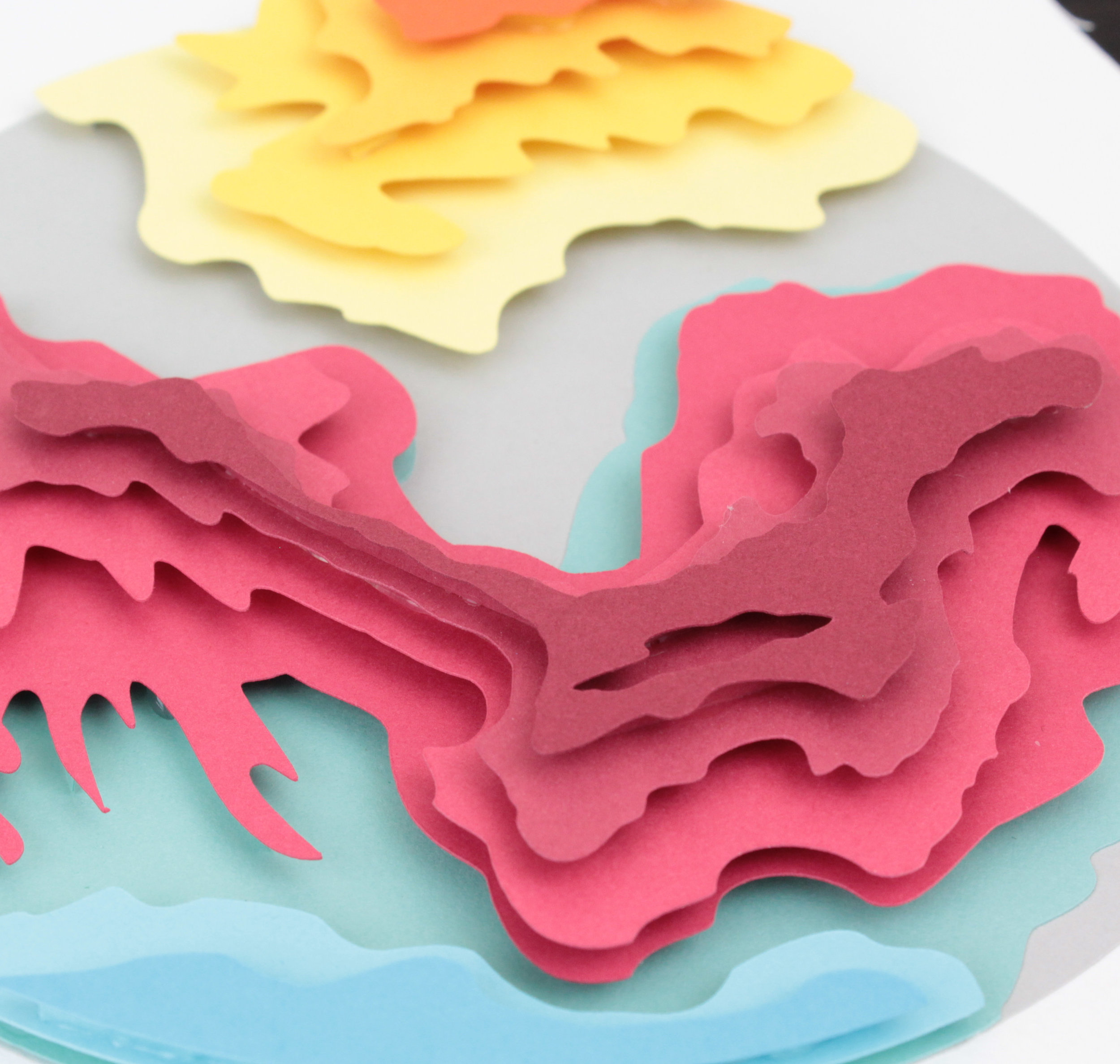
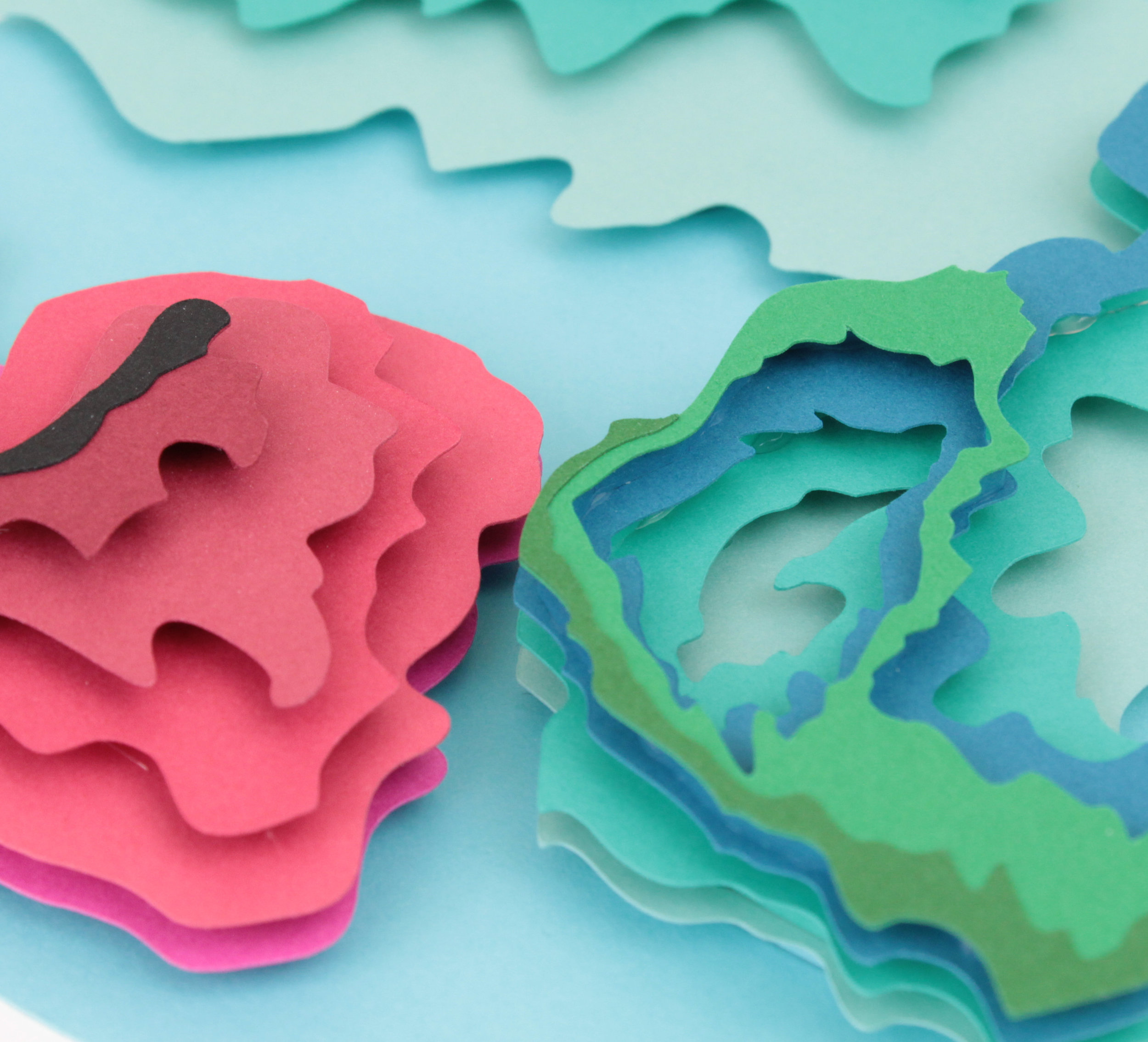
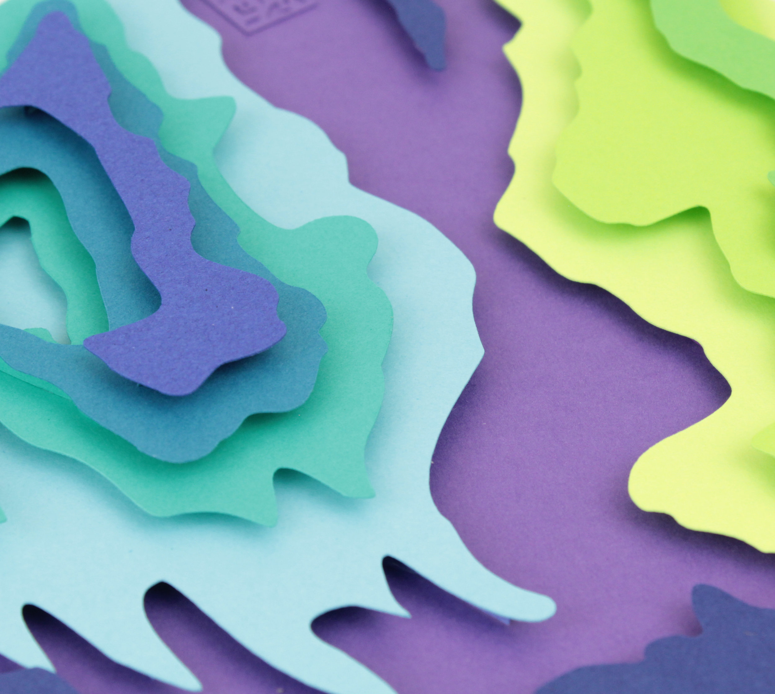
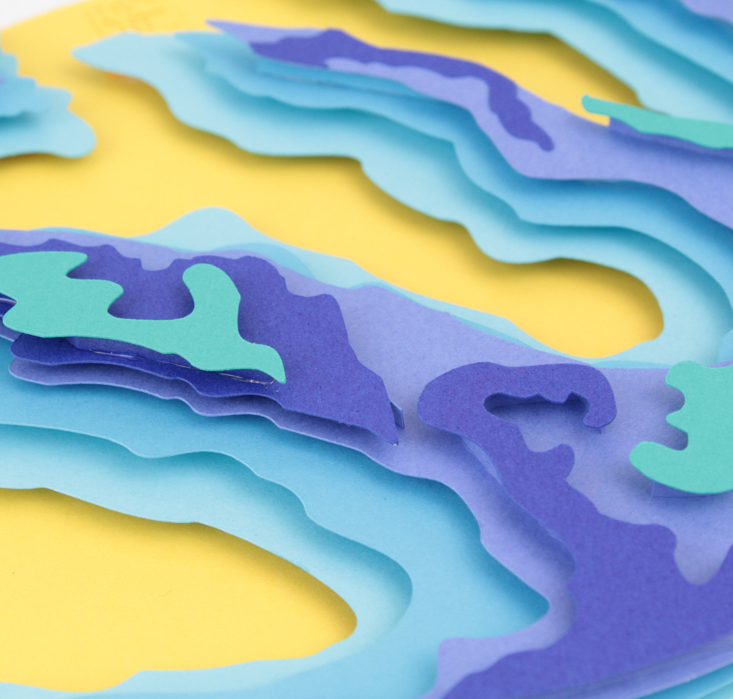
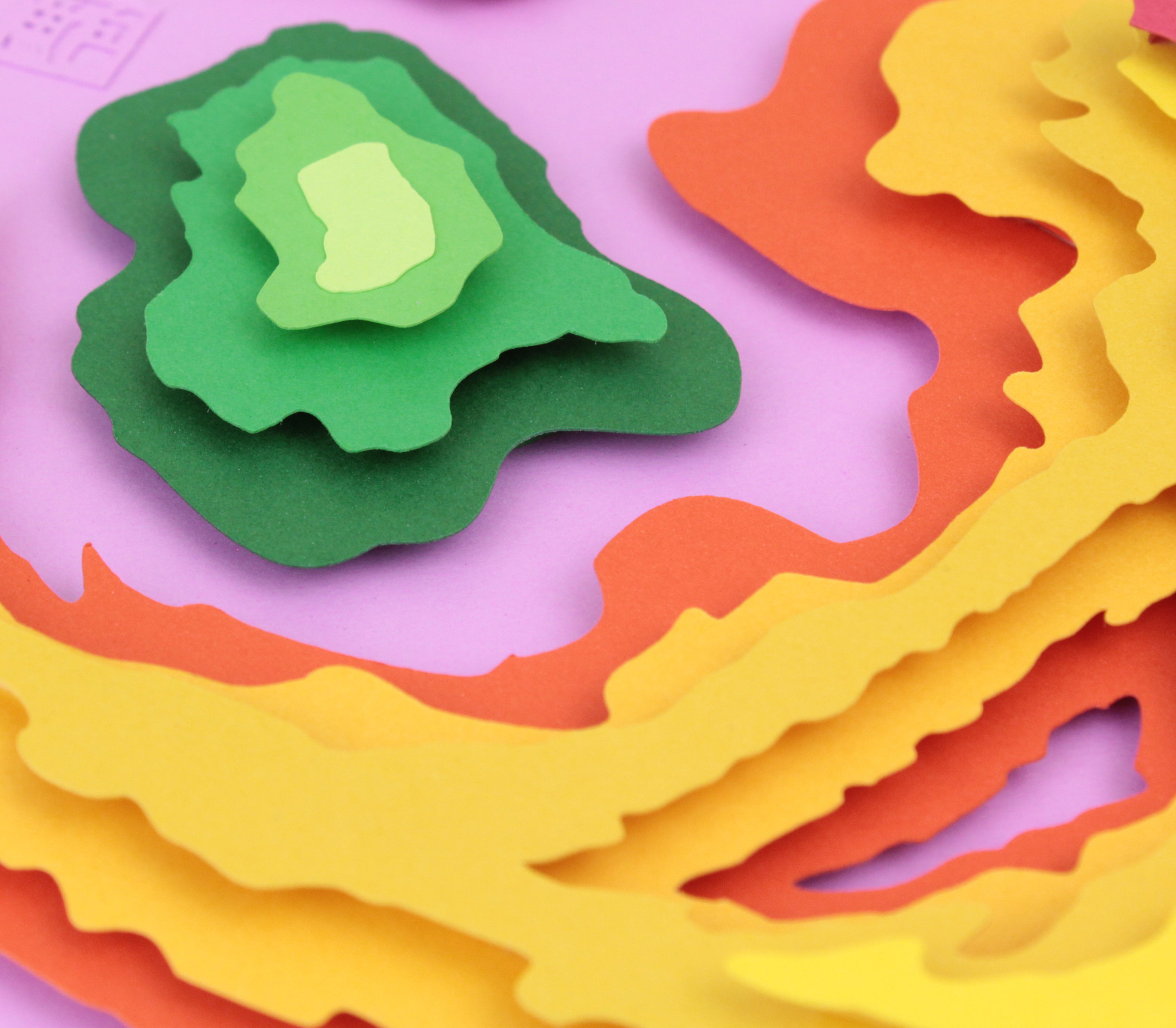
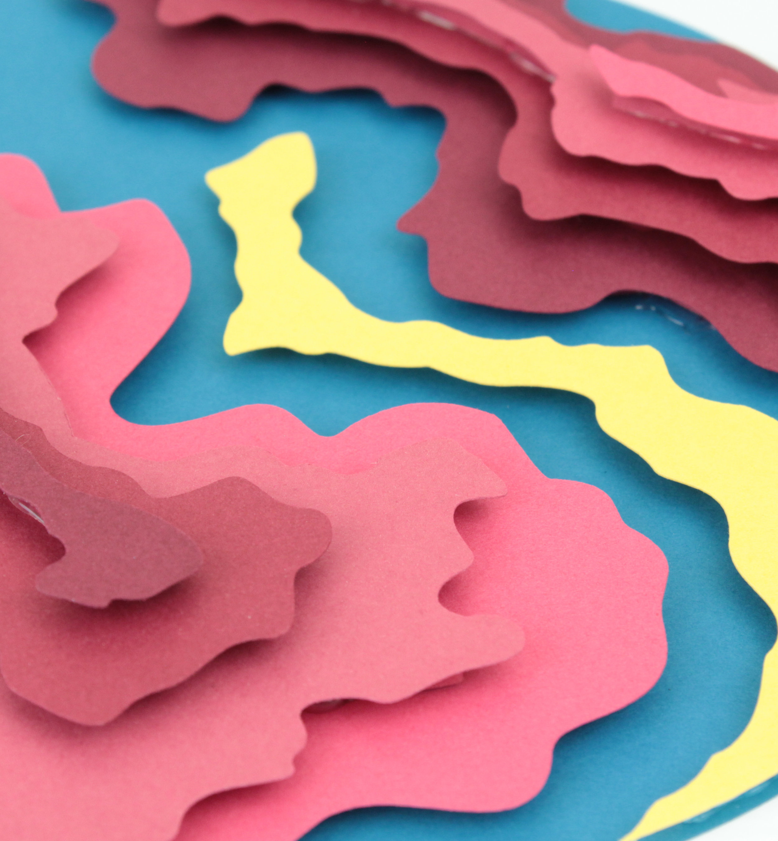
I get many comments about whether my abstractions are topographical maps of certain locations.  Locations that the viewer may have a connection to or not.  Maybe I chose to create a location using bright colors; which is an idea for future pieces as impressionistic art.  A chance for someone to enter the world of POWPAPER with points of reference so that the travelers have a real world map.  Possibly, but my abstractions come from another place and create a different world. 

Walking through artist studios I stumbled across the used wooden and disposable paper palettes of painters.  These remnants of ideas and experiments in color, theories from the minds of creators of worlds. The foundations for masterpieces and amateur art are built on paint palettes before the main structure is built on canvas.  Colors line up and begin to dance and mingle as the mind of the painter begins to work and solve dilemmas. These foundations became the basis of my abstractions in paper form.  The swirl and mixing of paint to transform into new colors, the abandoned trials, and the abstract computations.

This series is available on the Shop Page.
Art, Review

Traditional Meets Modern

Traditional motifs meets modern design

After spending years as a Graphic Designer and Illustrator I started creating my paper art.  With my background my pieces started with a heavy focus on design.  Alongside my design style I tended to use an abundance of bright colors.  Many of my earlier paper art piece tended to have my aesthetic using bright colors.  The use of bright colors was to reflect my style, though not appealing to the broader audience. 

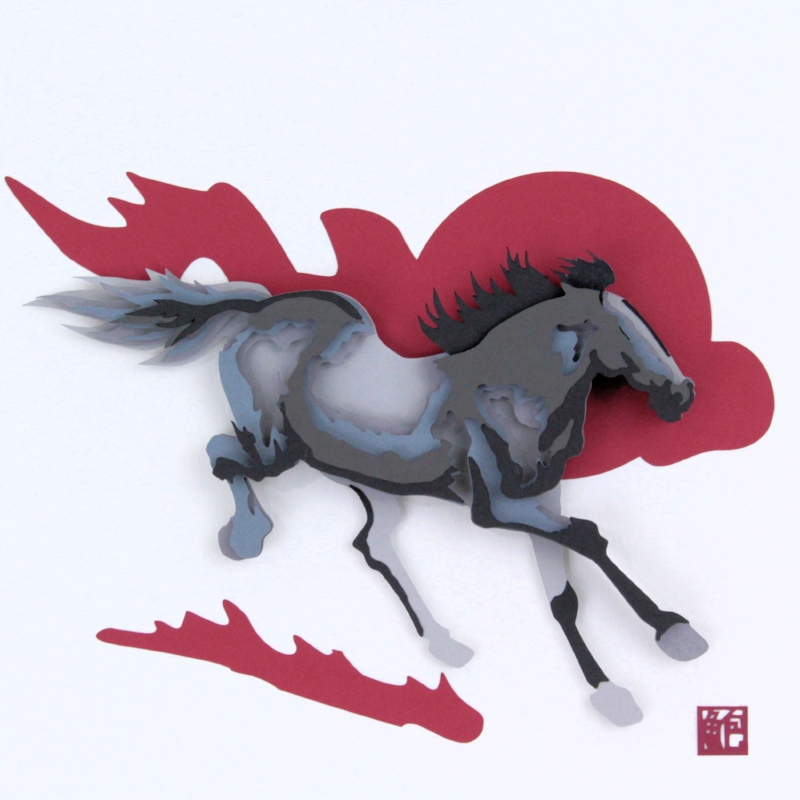
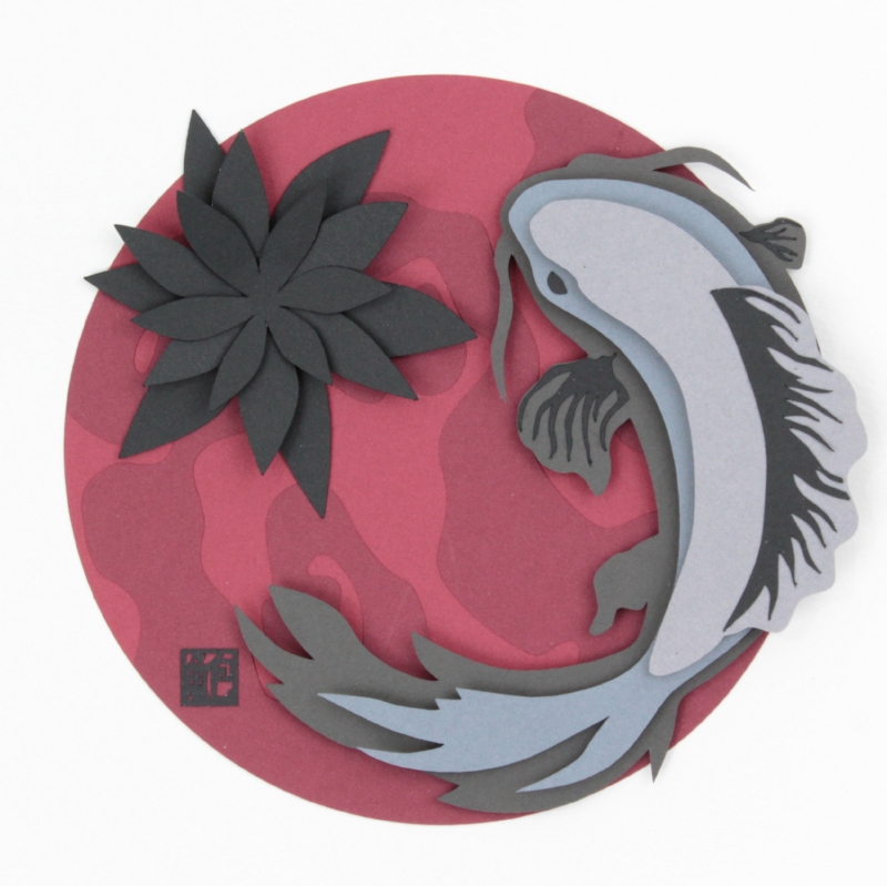
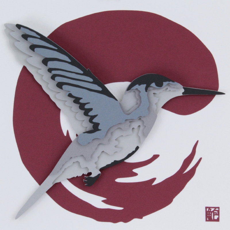
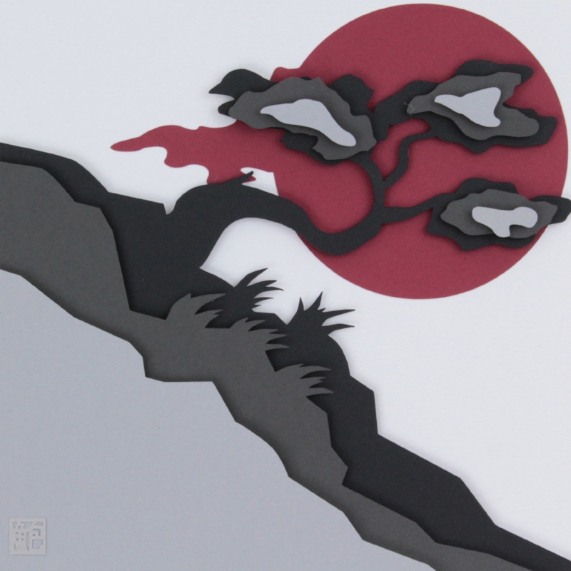
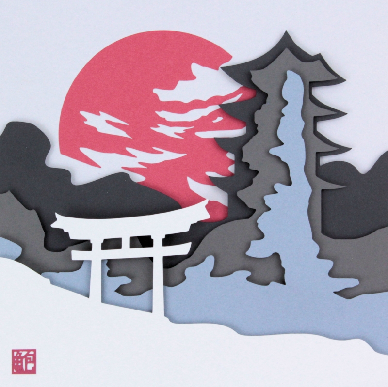
Recently, after giving in to the numerous requests for a traditional palette I have created a mini series of a limited color palette.  I looked into what else used limited colors effectively and found traditional Asian ink paintings to be highly effective.  So to bring some of my culture to my portfolio of work I began creating a small series of work in tribute to the past. So I started with the general imagery with red accents.  

Horse and Hummingbird pieces were created while mimicking the varying intensities of ink and ink absorption into a paper canvas. The Koi, Bonsai, and Pagoda pieces use the accents of red to make a bold statement. These are several of the many pieces I have created in 2018.  Please let me know what you think in the comments below.